
Paint Colors for home interiors – 7 Designer tips for using color
Want to pick up some tips on how to choose paint colors for home interiors and get some interior design color ideas along the way? Then keep on reading!
Here are 7 designer tips for choosing paint colors and using them in creative ways. Read on to get professional knowledge and inspiration that will make your next paint project successful and stylish!
7 Tips for choosing paint colors for home interiors
Want a cost-affecting way to make a big impact on your home’s overall look? In this article, I walk you through the process of color selection and provide interior design color ideas for using paint to enhance your spaces without spending a lot of money.
Throughout my years of engagement in design and home improvement, I’ve witnessed numerous color trends come and go, leading me to adjust home renovations and styling accordingly. However, my most powerful tool in transforming rooms has been painting.
Picking paint colors is often one of the most important decisions in design and decorating because the color will transform the entire energy of a space. So take your time to make sure you get it right!
Based on my experience in renovations and home flipping, I have 7 tips for choosing paint colors and using it in different ways as a budget-friendly way to make the biggest impact on your rooms.
Tip # 1: Consider color palettes, to see what appeals to you the most
When considering paint colors for home interiors, first determine whether you prefer a cool, warm or neutral color palette.

Image by Macrovector on Freepik
Pro-tip for choosing paint colors for home interiors:
In selecting paint colors for home interiors, if you want to paint an accent wall, but are not sure what will go well with your non-neutral colored walls, a good approach is to have both the accent and the overall room color painted in either all cool or all warm colors.

Photos by At Home with Dia ©
For instance, a warm terracotta color feature wall with pale yellow walls or warm beige is an easy combination. Another example could be a cool tone navy blue accent wall with the rest of the walls painted in very pale green. Of course if your main walls are in a neutral paint color, then you can go with either cool or warm tones for your accent wall.
Pro-tip for choosing paint colors for home interiors:
When choosing paint colors for home interiors, keep in mind the color of fixed elements in the room like countertops, wall tiles, floors, etc. These are foundational elements of a room and their colors are not easy to change, so work with them, not against them.
As an example, if you have cool gray countertops then it’s best to go with a cooler tone on your kitchen walls because a warm color would look a bit off compared with the cool-colored counters and vice versa. To keep a cool color palette in a room from looking too cold include a few wood pieces and accessories in subdued warm colors.
If you are not sure where to start, look around for interior design color ideas and inspiration.
Identify something that brings you joy. It can be a color you love in a textile like a rug or pillow, it can also be the colors in a painting or a piece of décor. Use that as your inspiration to set the color scheme of your space. Pull a color from that item and consider using it to paint the entire room or use it as an accent wall color.
When looking for interior design color ideas, keep in mind that a feature wall needs to have friends in the room. In other words, if you choose blue for your accent wall then include accessories, pillow, throws or decor in a similar color to tie in with the blue color so everything plays well together.
If you love a color but find that after you have painted an entire room it looks too bold or dark, try adding white or light-colored drapes and soft textiles in that pale neutral colors to provide some visual relief.
Tip # 2: Narrow down your paint selection to no more than 3 or 4 colors

Image by Freepik
Before you start the process of choosing paint colors for home interiors you need to determine your overall objective. Do you want to add a pop of color, or are looking to bring more drama and interest to your space? Or maybe you are simply trying to choose a paint color for your entire house that will work well in each room’s sun exposure?
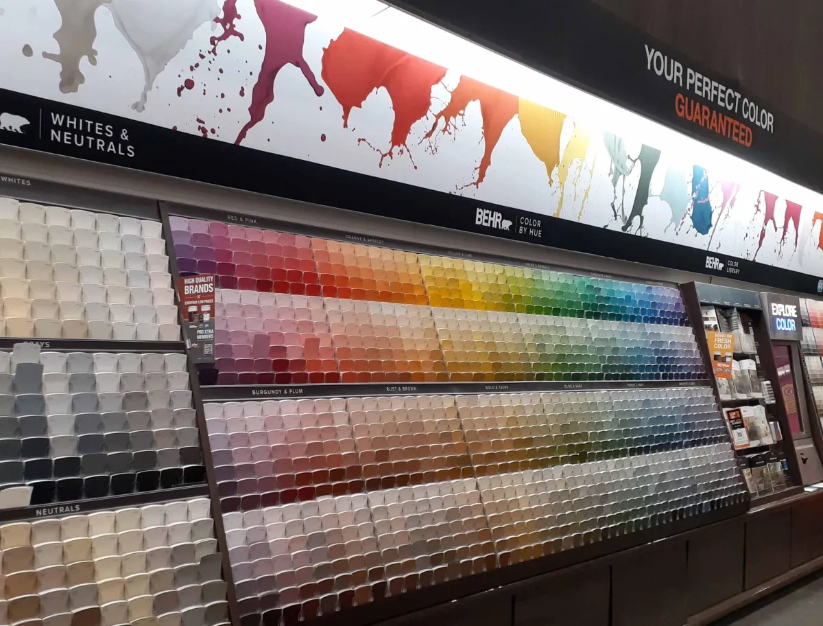
Once you decide what your paint goal is, go to the paint store and pick any and all paint chips that you find appealing. Consider the paint chips like all those people who line up to audition for America’s Got Talent. Not all contenders make it through to the next round of auditions.
You will notice that the lighting at the store can be quite deceiving and may find that some of the colors look very different once you step outside the store. You might even decide there and then that some are a definite no.
To help narrow down the paint colors for home interiors, start by taking a careful look at the paint chips side by side and remove those that don’t fall into the cool, warm or neutral color palette you choose based on tip #1. For example, if you prefer a cooler color scheme but some of the paint chips you picked look like they have yellow or orange undertones, then eliminate those from your selection.
Pro-tip for choosing paint colors for home interiors:
Put those color chips aside and then stick the 2nd round of contenders onto a white piece of paper with at least 1 inch between each color card.
The white paper background will help you see the colors for what they really are, without being affected by neighboring colors.
Then remove any colors that you don’t absolutely love. It may be difficult to pick only 4 but going through this process of elimination always helps.
Once you have narrowed down your final contenders, it’s time to put them on stage and see how they perform against each other.
Tip # 3. Don’t trust the color you see on paint chips – test your paint colors

Photo by At Home With Dia ©
Before deciding which paint colors for home interiors to go with, get a large white poster board, buy sample pods and paint 8 x 8-inch color swatches keeping them far apart as possible.
If you prefer not to paint, then you can order pre-painted peel and sticky samples straight from the paint company’s website or from Samplize.com which you can then adhere to your poster board.
The larger paint swatches will allow you to see how the colors look in your specific room.
Pro-tip for choosing paint colors for home interiors:
The bigger your paint samples the better! I have been known to paint multiple individual poster boards in different colors, so I could get a better idea of how they will look on a larger scale. This is especially important when you are trying to select paint colors for home interiors that are very similar, like different tones of off-white.
Many designers suggest painting color swatches directly on your wall, but I find that in some cases, the existing neighboring wall colors can affect the way your samples will look because colors reflect off each other.
Tip # 4. Spent time with your color options
Place the poster board on the wall you are planning to paint and watch how the color looks at night, in the morning, and afternoon.
If you are painting a whole room or the whole interior of your house, then move the poster board to different walls and see how the color looks in the varying light your space is exposed to.
When selecting paint colors for home interiors keep in mind that sunlight plays a very big role in how paint colors will look in specific spaces. North-facing rooms may give off a cooler, bluish cast to colors, whereas colors may look yellowish in South-facing spaces. How the sun reflects off buildings or landscapes outside your windows also affects the way the color looks. For example, have you noticed that a white wall can look pinkish if the room’s windows face a red brick house?
As mentioned before, paint has the amazing power of transforming rooms. Once you have chosen your desired color you may want to also consider some interior design color ideas.
Tip # 5. Create an accent wall

Photo by At Home with Dia
Accent walls have been all the rage for the past several years and many say that this trend is going out of style. But I say, when looking for interior design color ideas, if you fall in love with a specific bold color but are reluctant to paint the whole room in that color, start by using it to create an accent wall. Upon seeing it on the wall and living with it briefly, you might be inspired to paint the entire room that bold color!
Accent walls can be a shade that complements other colors in the room or can make a bolder statement.
Normally, the best wall to paint as a feature wall would be the one facing you as you walk into a room. Therefore, pay extra attention to which wall you decide to accent. Adding a different color to that wall will make it a focal point.
Tip # 6. Use paint to enhance other features in your home
For more interior design color ideas, consider painting your doors, baseboards, and trim in a contrasting color to your walls. Gone are the days when woodwork was painted in basic neutral colors of white or cream. Nowadays you can keep your walls a light color and go bold on your trim and doors. Just make sure that the color you choose is one you feel comfortable living with for many years. If you were to get tired of the color you painted on all your doors and trim in a couple of years, changing the color of these surfaces would demand additional work and effort.

Photo by At Home with Dia
You can also paint built-ins a contrasting color. That draws attention to them and makes them a feature of the room.

Photo by At Home with Dia
A great way to accentuate bookcases and make decor pop, is to paint the back a contrasting color. This is an easy way to make a statement. If you decide to change your color scheme in the future it can easily be painted a different color.
Tip # 7. Use paint techniques to give dimension to your flat walls.
There are many creative interior design color ideas for using paint to make a huge impact in a room.
You can easily give your walls a designer look with some painter’s tape and a couple of quarts of contrasting paint colors.
Technique # 1: Create interest by painting stripes or patterns on your walls
Use light muted colors for a tranquil effect.

Photo by At Home with Dia ©
Try using two light tones of the same color to create wide vertical stripes on a single wall. This provides a soft focal point in the room and the lines make the ceiling appear taller.
In children’s rooms, you can be a bit bolder with the color of your stripes.

Photos by At Home with Dia ©
The bold blue and green stripes in this room were painted by masking off the white wall from top to bottom with painter’s tape at 10-inch intervals and carefully rolling the accent colors in between the tape. This treatment is an easy weekend project and ties in with the room’s overall color scheme.
Technique #2: You can also create interest by using stencils or decals on an accent wall color

Photo by At Home with Dia ©
In the above example, a wide blue band was painted on the upper half of the walls around the room. Once the paint was fully dry, decals were added to create an “outer space” themed room.
Decals are a fun way to inject interest into children’s rooms. They can also easily be removed when they grow out of that phase of their life.
If you are looking for more interesting but subtle interior design color ideas then you can try out an ombre effect.

This paint technique is achieved by using 3 or 4 shades of the same color or even different colors. These are painted in thick horizontal stripes one above the other. While the paint is still wet you blend the lines with a brush, so they look like they are fading into each other. For best results paint the darker shade on the bottom followed by the lighter shades above.
So there you have it! You are now armed with the knowledge of how to pick paint colors for home interiors. You also have some ideas on how to use paint to transform your rooms. I hope these tips help you when deciding on your next paint project. They’ll provide you with interior design color ideas to add a designer touch and panache to your space.
If you're currently planning your next home decorating project, these additional resources may help inspire your space:
